The best I’ve ever seen #7: The 91/93 Potato Print Away Shirt

We continue our ‘Best I’ve Ever Seen’ at Swindon Town series. Following the release of the 2015/16 kits last week, Brendan Hobbs gets creative with some green paint and a potato…
Moving house, ever done it? Dreadful experience, a dirty, smelly, total aggravation fest. And by ‘house move’ I don’t mean a temporary flat shuffle – or a half-assed university move, which let’s face it is just a few boxes crammed full of bongs, pornography, Oxfam clothes and envelopes stuffed full of parents hard earned cash.
I mean a full-on big house move, I did it not so long ago and we had a lot of furniture to shift – not to mention a tonne of the wife’s boxed up crap and a tidal wave of future landfill courtesy of my children. But the attic, wow, a packed haven of lost memories, discarded rubbish, unworn clothes and sentimental bullshit, the contents of our attic practically filled the removal van on its own.
Every box taken down from that dusty, spider flat-share got me angrier and angrier, by the end of the experience I wanted to slay every human I clapped eyes on, preferably with one of the many unused garden tools that I discovered I still owned.
However, there was one bright spot amongst the carnage, the discovery of a box crammed with wonderfully random stuff. A treasure trove of bizarre, unrelated nick-knacks, all discarded loosely, or stuffed into carrier bags or plastic tubs.
In amongst the tat were some old issues of the 69er, which included a range of my early consequence-free fanzine writing, plus a carrier bag of old football tops.
Now, I have many, many football tops collected over the years. They are kept neatly in drawers and storage boxes but I was always missing some and I could never work out where they were, until now.
The real find in this bag was the 92/93 promotion year green and white potato print away shirt, ohhh the squeal of delight when I found it – I stripped off my t-shirt and hauled it on straight away. Ahhh, that familiar seam splitting tension as my melon head eased through the appropriate hole, the soft caress of cheap, highly flammable man-made fabric on my skin, the smell of the tears from the dozen or so sweatshop workers who made it – yes, daddy was home.
My ladder-holding wife was quite surprised when I emerged from the hatch. After all I ascended in a normal t-shirt and came down dressed in a (rather tight) shimmering, TV-on-the-blink eyesore. I forget what expletives she uttered as I was king among men; I stood proudly, staring off into the mid-distance, already reliving fondly remembered away-days.
Yes, the ‘potato-print’ edition was the marmite of Swindon Town tops, loved and loathed by the fan-base in equal measure. It once appeared in the Hall of Shame feature as a possible ‘worst shirt ever’ but thanks to you dear readers, it was never voted in.
It was Diamond Leisure’s first dip into football apparel manufacture, it was clear that the well-known sports behemoth wanted to make an early mark in this overcrowded market; make a statement, impose some branding, show off their graphics arm as a bunch of couldn’t-care-less free thinking radicals.
What they got was clearly inspired by a night of heavy drinking, drug-taking and the resulting puked-up pavement pizza. As they stared at the steaming pile of bile, the pattern appeared to take on a life of its own – like one of those popular 80’s magic eye pictures. I know this because people would often stare at my top for hours, hoping that a leaping lion or diving aeroplane would make itself known.
If the internet had been in full swing back then, just imagine the comments on www.footballshirtculture.com

If the whole childish artwork demographic was in demand, and seeing as we’ve recently swapped Adolf for Rudolph in the Dassler brother’s stake, I seriously think Puma have missed an open goal with their recently unveiled strip. We don’t want simple, clean and classy designs, we want jarring familiarity with a migraine on the side – they so should have plumped for this:
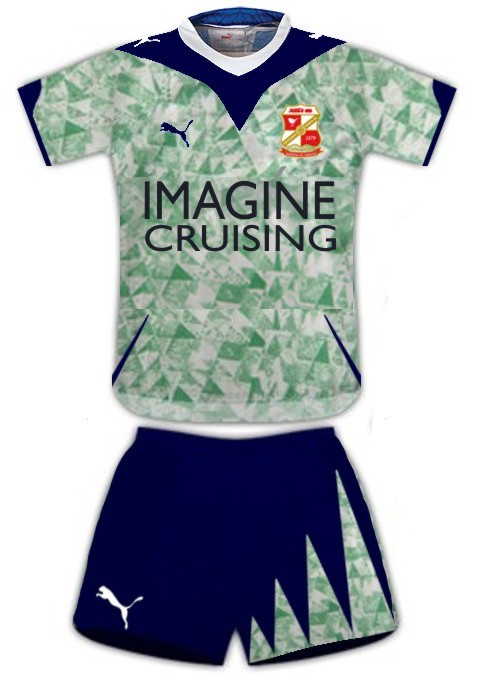
Why mess around with perfection? If they launched this we’d all be frothing at the mouth (in happiness or rage?) And I’m pretty proud of the shorts.
Personally I loved the old kit, despite all the negativity I’ve already jotted down here, but I still remain unclear as to why? Maybe it’s because of its hideousness, like a girl who wasn’t particularly attractive – but somehow you’ve always fancied grabbing her for a sexy cuddle.
Maybe it was the diversity it caused amongst supporters that I liked, I remember wearing it once to Upton Park for a particularly spikey encounter with West Ham. Town trotted out one nil winners thanks to a late deflected free kick and some inspired heroics from Nicky Hammond – proving once again that he wasn’t the oft perceived mis-kicking, talentless goon he was made out to be.
Predictably I got some mighty abuse prior to the game from Hammers supporters, but also from Town fans. But to fair, it was all quite light-hearted and funny: ‘look out lads, there’s’ been an explosion at the paint factory’, or ‘you allowed your kid to draw on your shirt?’
I canvassed opinions online, the top already has a cult following – I believe there has been a few attempts on The Town End forum to organise a designated ‘Potato Print Top Day’. One person quipped that ‘my eyes need to be removed with hot pokers now that I’ve seen it again’ another stated that they would need counselling as they had only just ‘forgotten its existence’, whereas someone simply pointed out, ‘wouldn’t plain white have done instead?’
But there was also a tonne of support, it far outweighed the negatives. In fact I think the home shirt for the Premier League season was far, far worse, I mean just look at the detailing – it hints at a swirling collage of blood and viscera, seeping busily towards a drain. In fact I believe the shirt is in high demand by shows such as CSI, Bones and other trashy American pseudo ‘sit-coms’. They simply lay the shirt underneath a corpse as it passes brilliantly as a pool of congealing blood. Once done, it can be rolled up and used for the next butchered vagrant or whatever.

I apologise, I’ve probably ruined that shirt for you now as well, you’ll never be able to look at it again in the same light. The swirling detailing probably didn’t grab your attention before, but now some internet keyboard savage has trotted up and pointed it out. Thanks.
It’s like the Starbucks logo, you all know Starbucks? You know their logo, right? The sort of…. well… a circle… with some sort of…. ermmm.
You’ve all seen it, but never actually looked at it. So it might surprise some of you to learn that your favourite morning pick-me-up comes courtesy of an establishment whose logo features a drugged up hippy woman wearing nothing more than a beatific smile and a plastic party store crown, she’s also wrestling a door-draught excluder, but that’s more opinion than fact. (Yes, I’m just being funny, but the reality is just as weird – I mean, a twin-tailed mermaid, what?)
So we’ve established that the green potato print elevates a perfectly good plain shirt into something wonderful, so this made me wonder how many other plain garments could be enhanced by such a process? How great would a run of the mill shirt be if I let my two boys run riot with a potato and some paint?
I have a work shirt, it’s an awful washed out colour, an off-white, creamy affair – basically it’s the colour of jizz. What’s more unpleasant is that the material is quite thin, yes that’s right – you can see my manly nipples through it as plain as day.
I think I was given it as part of a multi-pack, I’ve never worn it and I don’t think I ever will as I work in one of those modern offices where you can wear what you like – within reason of course, I don’t think my managerial kudos would shine out of a gimp suit for example.
So like Alex Murphy in Robocop, we had our ‘volunteer’ for this radical transformation, except this time it was via an unwise purchase rather than being murderously gunned down by a bunch of drug-addled maniacs. But it was a prime candidate for the facelift; I mean would you trust this kind of guy if he walked into boardroom:

Probably not, you can see his nipples for a start and the shirt colour looks like he’s spent the morning beating off co-workers in the lav’s.
I set to work in the lab, crafting the tools needed. I also had a sweatshop of two staff, eager to make a mess.

And behold; now Alan Sugar would f-u-c-k-i-n-g shit himself if I walked into the boardroom looking like this. I would be a force to be reckoned with, I would serve the public trust, protect the innocent, uphold the law and… well, I’m sure there’s something else?

There we have it boys and girls, a true legend in sportswear has been born and if you don’t agree, that’s what the comments section is for, go for it, make your irrational counter-argument. Just remember one thing when you’re typing: “You’re wrong.”


